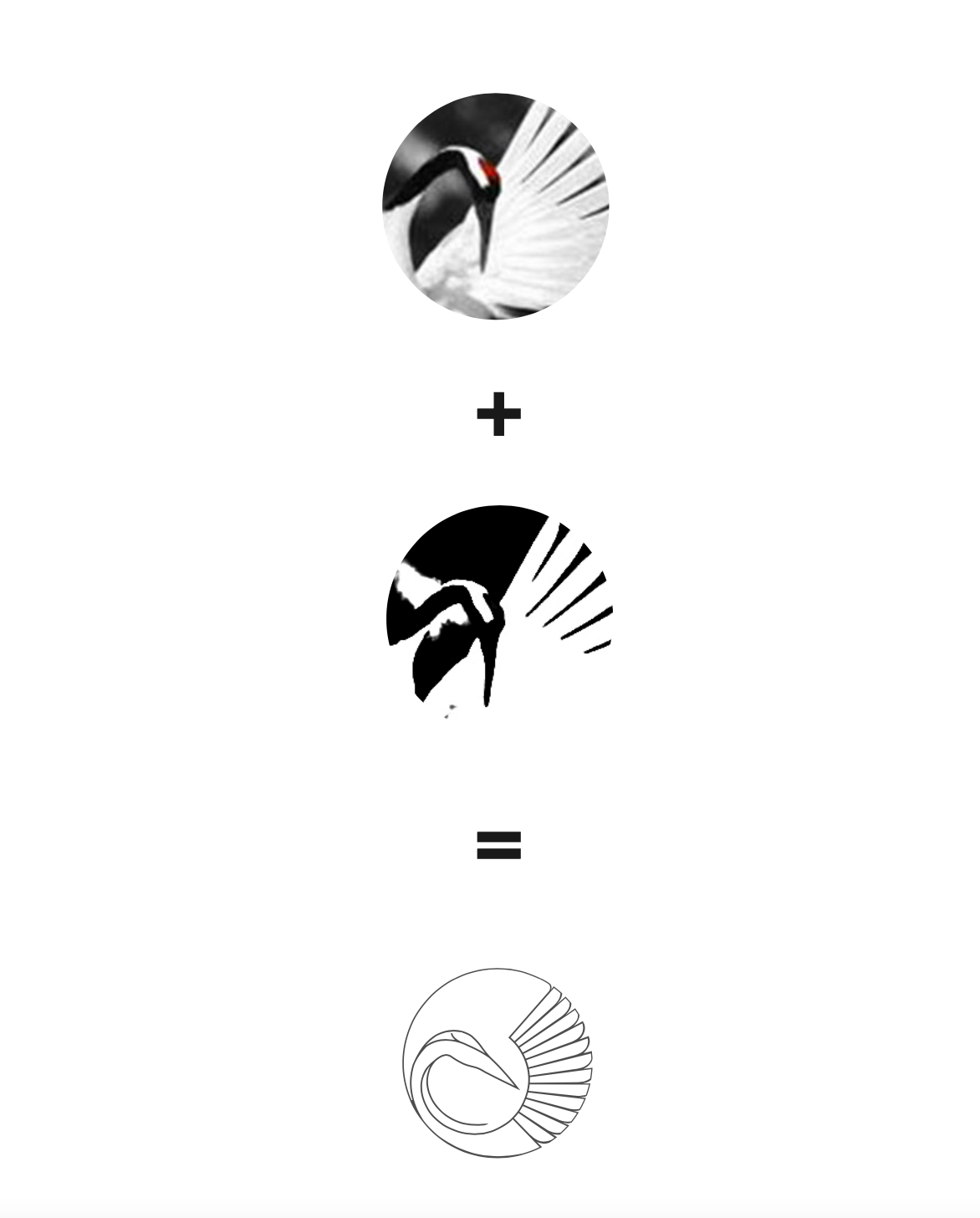
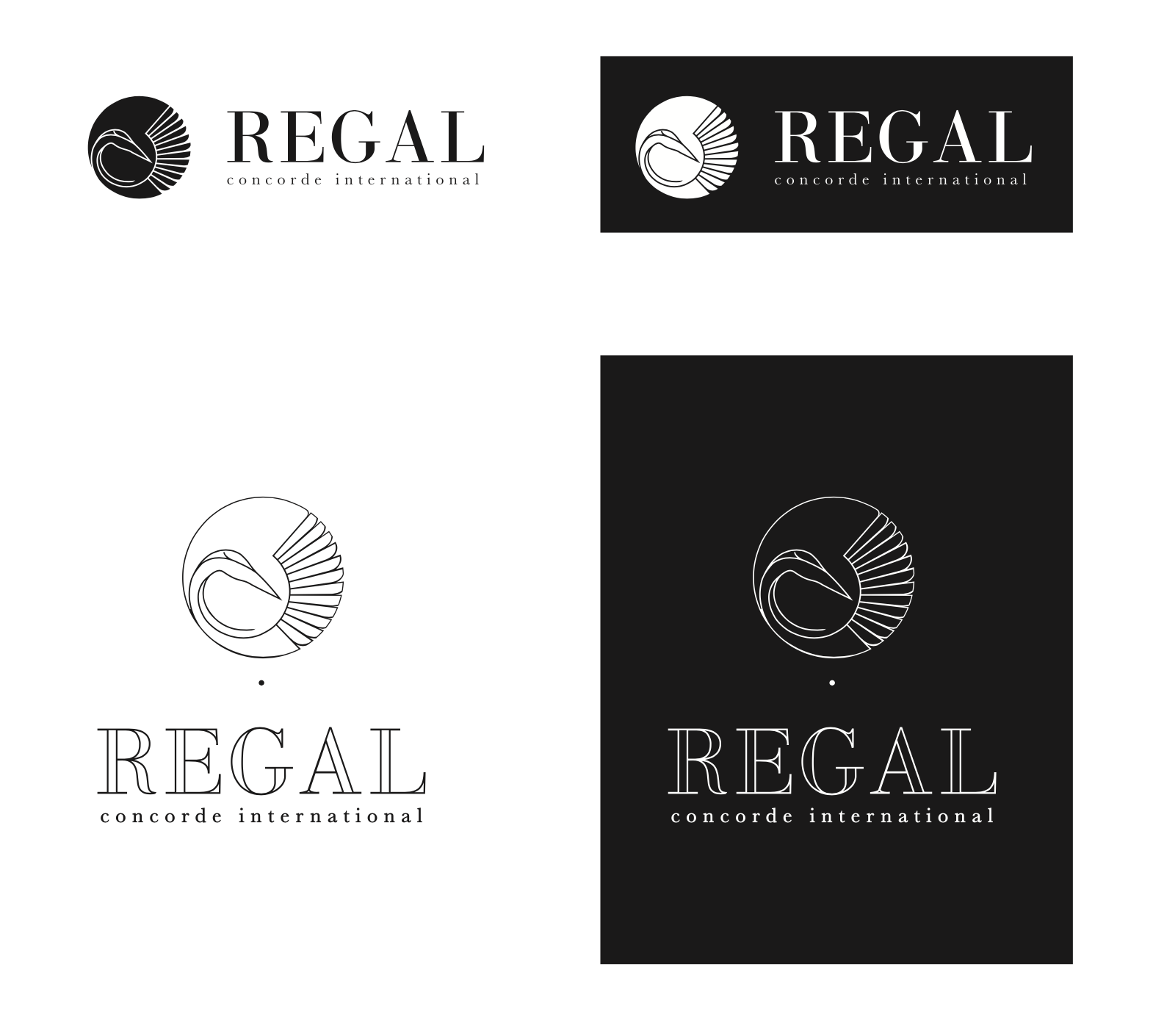
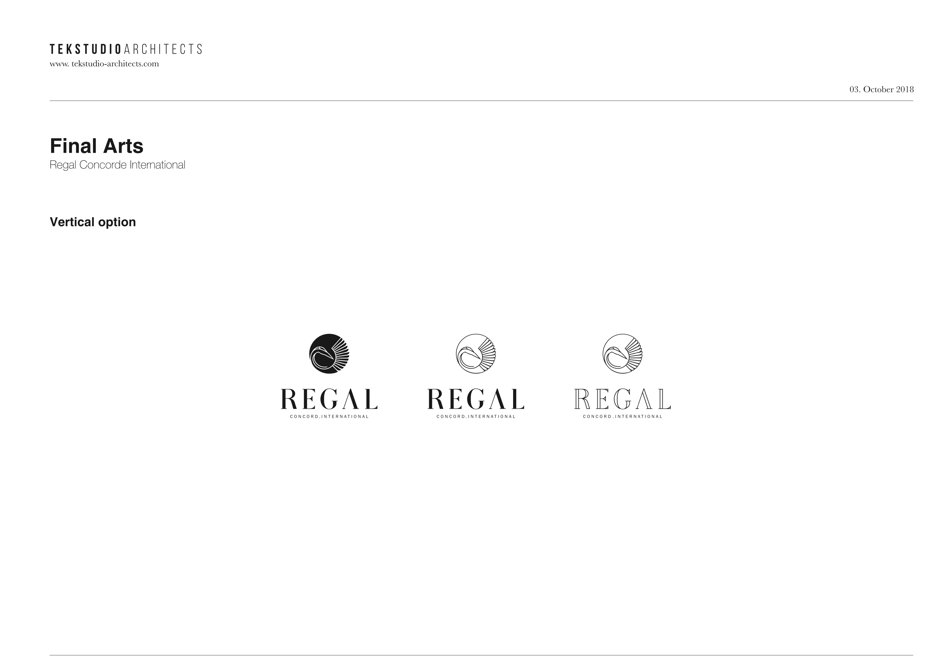
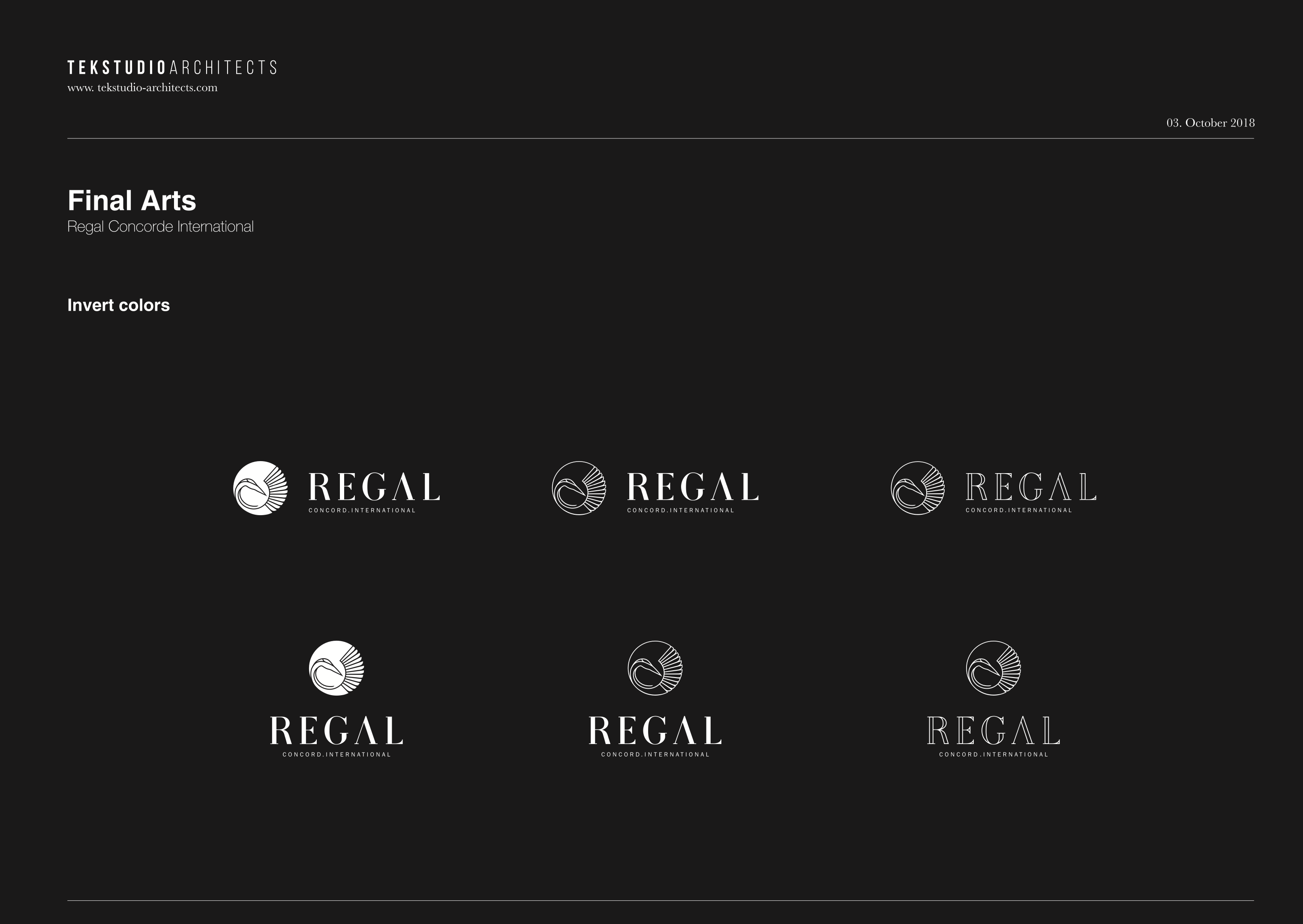
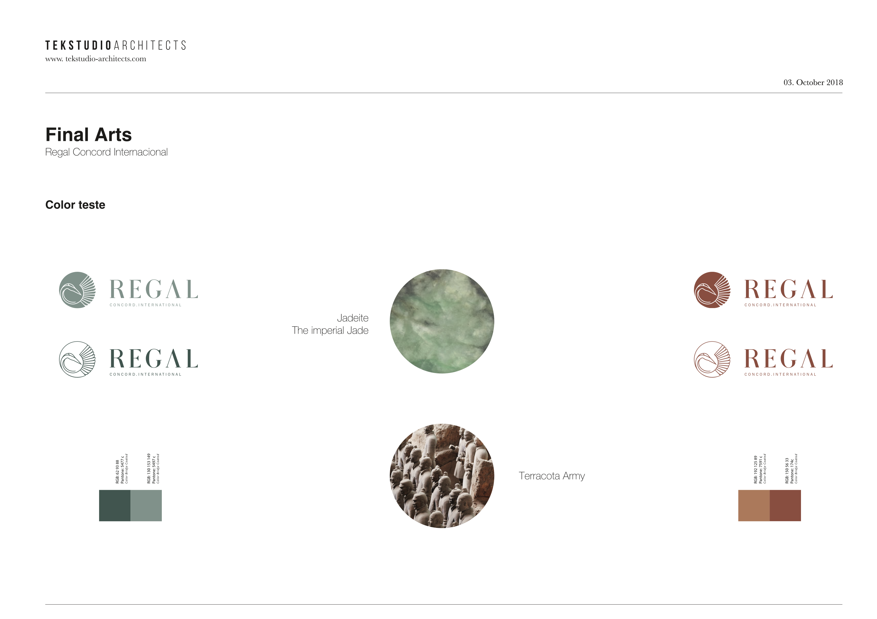
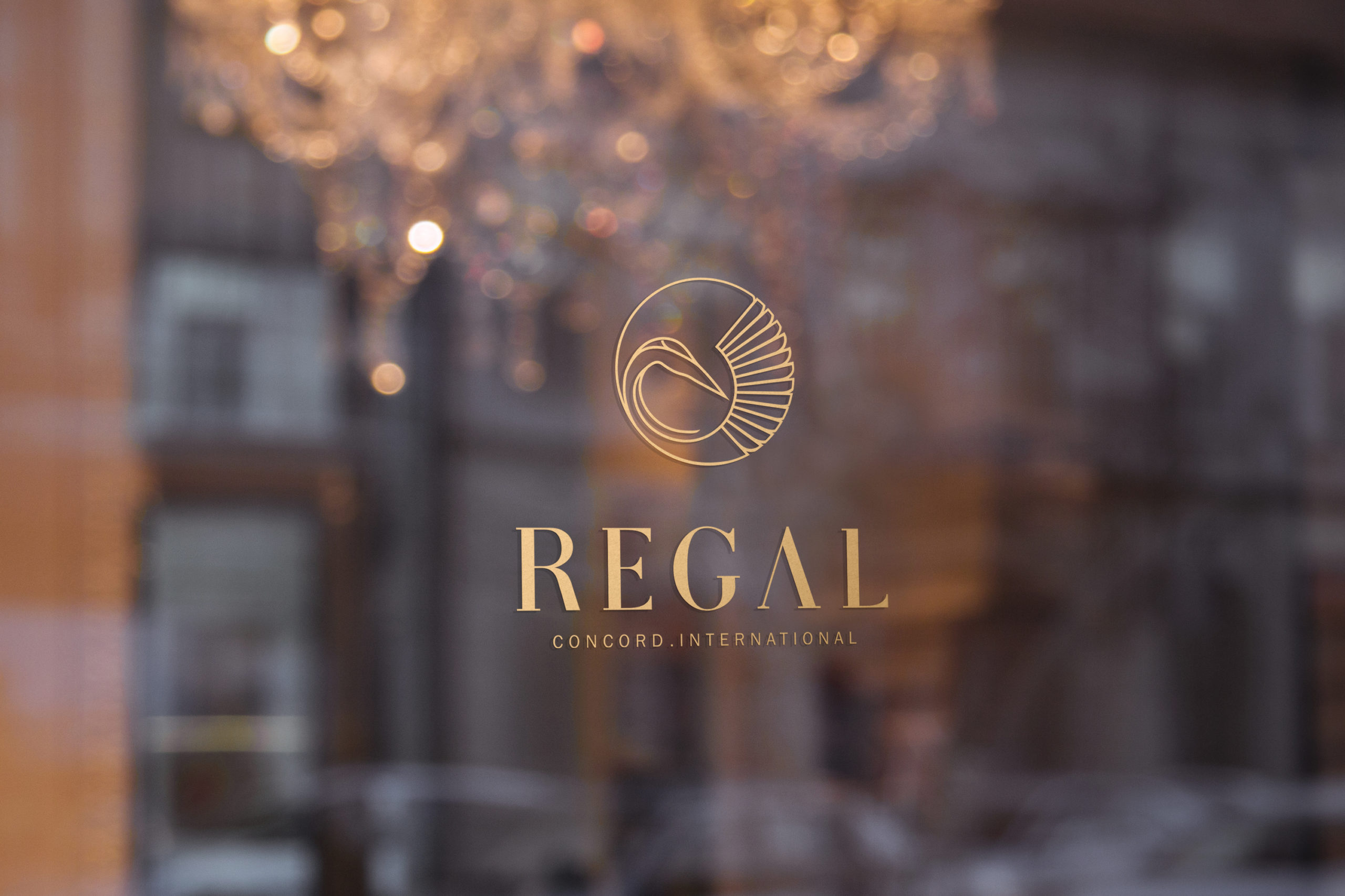
The logo for Regal Concord International, a premier chain of five-star hotels in China, elegantly embodies the essence of timeless sophistication. Drawing inspiration from the Red-crowned Crane—an emblem of grace and longevity—the design features a refined blend of terracotta and imperial jade tones. These colors reflect the historical majesty of the Terracotta Army and the serene elegance of jade, harmonizing traditional Chinese heritage with modern luxury. This logo represents Regal Concord International’s commitment to offering a distinguished and unforgettable experience, seamlessly integrating cultural richness with contemporary sophistication across its Chinese properties.